Champagne Tastings & Sabering

Project Background
The world of champagne and wine
Taste & Tintle provides wine and champagne tastings at companies and in people's homes, for groups of 2 to 80 people. It has a large network of collaborating locations in and around Amsterdam. Workshops are also offered, such as Champagne Saber workshops. Together with the customer, I discussed the wishes for a new website.
| Client | Taste & Tintle |
|---|---|
| Role | Visual Design & Front-end Development |
| Tools | Figma, Adobe Photoshop, Adobe Stock, Visual Studio Code, FileZilla, Wordpress, Mailchimp |
| Duration | 5 Days |
Challenge
Create a user-friendly, engaging website for multiple screen sizes, from mobile to desktop
The principal goal of the client was to make the visitor enthusiastic enough to request more information about the services/products via a contact form or quotation request. The house style had to be reflected in the design and be provided with many images, to convey the atmosphere of T&T well.
Proces
After all customer wishes had been discussed and mapped, an overview of all tasks was made. These were spread over the days. I worked with the Scrum method. With this agile approach, all outstanding projects can be handled quickly and efficiently. In this project, I independently performed all phases (design, coding, launch). After each phase, a colleague went through my tasks using checklists that we had prepared internally, to avoid overlooking essential details.


Design
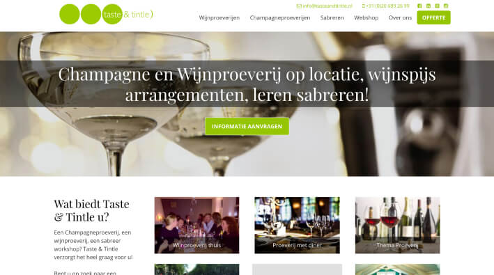
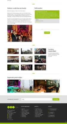
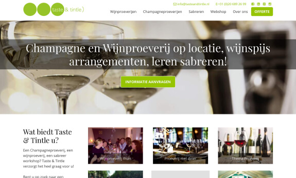
After the customer briefing, it was my job to design a homepage and an extra follow-up page. All I had was a logo and some images that the company provided me. In the briefing phase, I had already collected some ideas, so I quickly started making a wireframe with all the essential components in it. The fresh look of the logo is implemented throughout the website and a lot of use is made of personal images. Each tasting, workshop or location has its own personal images. The Instagram feed of Taste & Tintle is also retrieved at the bottom of the homepage. The client was satisfied with the first concepts and after some minor adjustments to the design, it was approved.
Tools used


Code
Now that my designs had been approved by the customer, it was time to convert my designs into code. I had to style all components and pages that I made in HTML5 and (S)CSS. Then I implemented all handmade code in WordPress and turned it into a custom theme. With some Php and Javascript, I also installed and edited some WordPress plugins. Then I created some custom user roles, exclusively visible to the customer.
Languages used
Tools used
Launch
When I finished building all the remaining pages with the page templates I made in Wordpress, it was time to test the website and debug it on a smartphone, tablet and desktop device. The website also had to be tested on various browsers. After this check, the website was ready to go online.


