Where people develop

Project Background
The learning service Partner of the Netherlands
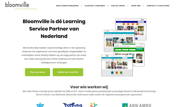
Bloomville is a large organization that provides a variety of business learning environments to maximize the development and performance of its customers' employees. With their innovative learning academy Anotherday, they create an intuitive learning environment. They do this for various leading customers, such as ABN AMRO, FrieslandCampina, KLM, KPN, Robeco, Van Oord, Vitens, ANWB and Rabobank.
| Client | Bloomville |
|---|---|
| Role | Visual Design & Front-end Development |
| Tools | Figma, Adobe Photoshop, Adobe Stock, Visual Studio Code, FileZilla, Wordpress, Mailchimp |
| Duration | 7 Days |
Challenge
Creating a responsive website with two additional modules
The entire website is to be visible on mobile, tablet and desktop. The primary goal is to make website visitors so curious about Bloomville's services, that they will complete a simple, quick check so that Bloomville can easily approach these new potential customers.
Module 1: Team overview page
The client wanted an additional ‘face/info book’ page, on which information on employees can easily be viewed and managed.
Module 2: Do the check page
A page with an online form, with which a realistic, general picture of a visiting organization can be obtained, as an efficient tool to open new business cases.
Proces
After all customer wishes had been discussed and mapped, an overview of all tasks was made. These were spread over the days. I worked with the Scrum method. With this agile approach, all outstanding projects can be handled quickly and efficiently. In this project, I independently performed all phases (design, coding, launch). After each phase, a colleague went through my tasks using checklists that we had prepared internally, to avoid overlooking essential details.


Design
My job was to design a homepage and additional follow-up pages. Content provided: the Bloomville logo, the corporate identity they use, the logos of their customers and individual images. They also wanted drawn icons to be included in the design, which would be shown as animations on the website. Since the main goal was to let potential customers fill out a test form, I provided the design with a "call to action" button.
The client was happy with the first concepts; after some minor adjustments, the design was approved. With the homepage as a basis, I could start designing the two module pages.
Tools used


Code
Now that my designs had been approved by the customer, it was time to convert my designs into code. I had to style all components and pages that I made in HTML5 and (S)CSS. Then I implemented all handmade code in WordPress and turned it into a custom theme. With some Php and Javascript, I also installed and edited some WordPress plugins. Then I created some custom user roles, exclusively visible to the customer.
Conditional logic
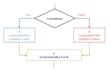
make the 'do the check' module possible, I made a form that can offer different results, based on selections the user makes during the completion. I used conditional logic and a point system to realise this.

Languages used
Tools used
Launch
When I finished building all the remaining pages with the page templates I made in Wordpress, it was time to test the website and debug it on a smartphone, tablet and desktop device. The website also had to be tested on various browsers. After this check, the website was ready to go online.


